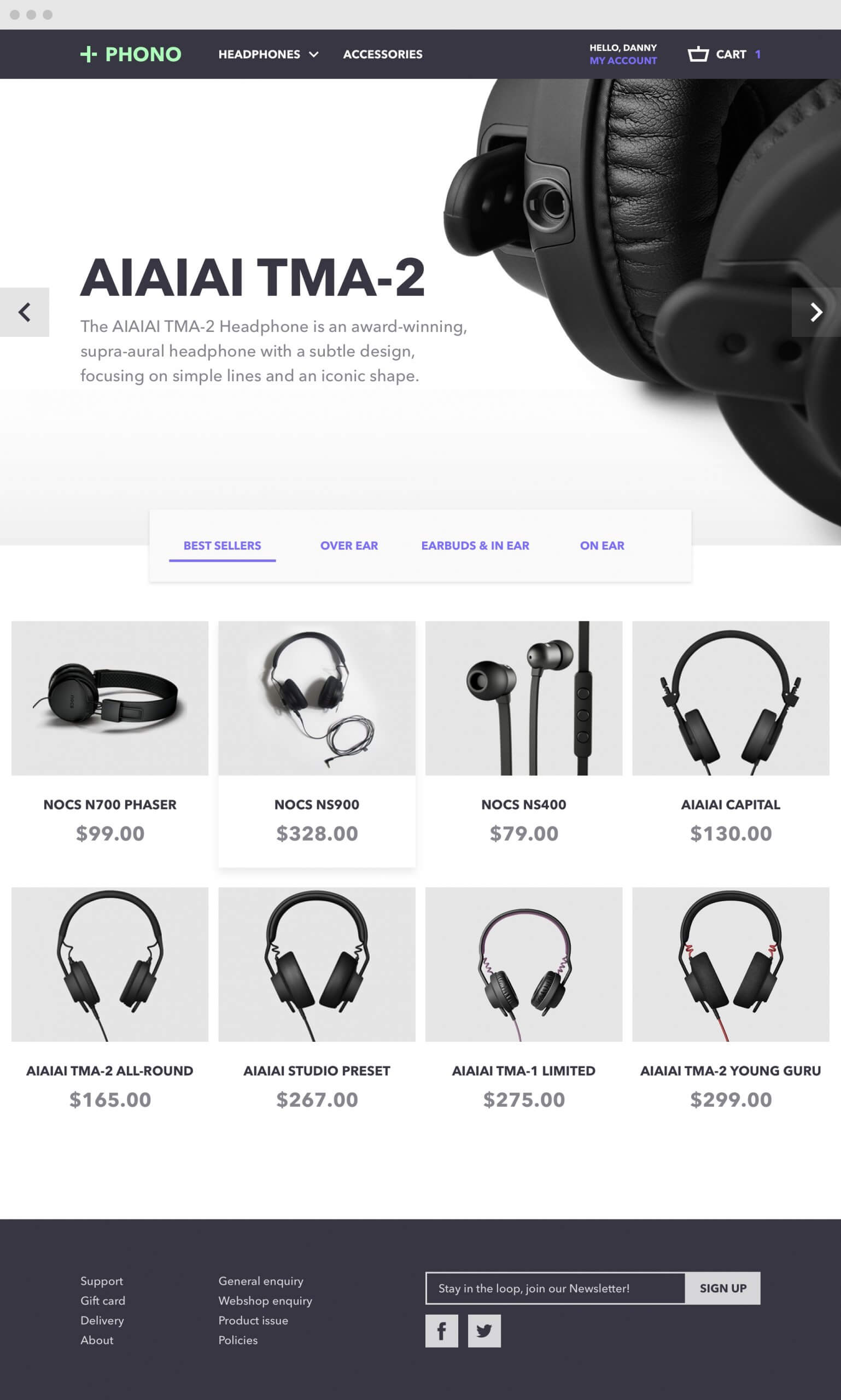
Phono
Crafting an e-commerce site for headphone enthusiasts
This is one of several visual design explorations I created for a client seeking a more visually appealing checkout experience. Although the project was ultimately put on hold, the client was highly satisfied with the design direction.
Year
2016
Research
Competitive analysis
User journey
Platforms
Web
Design
Branding
Visual design
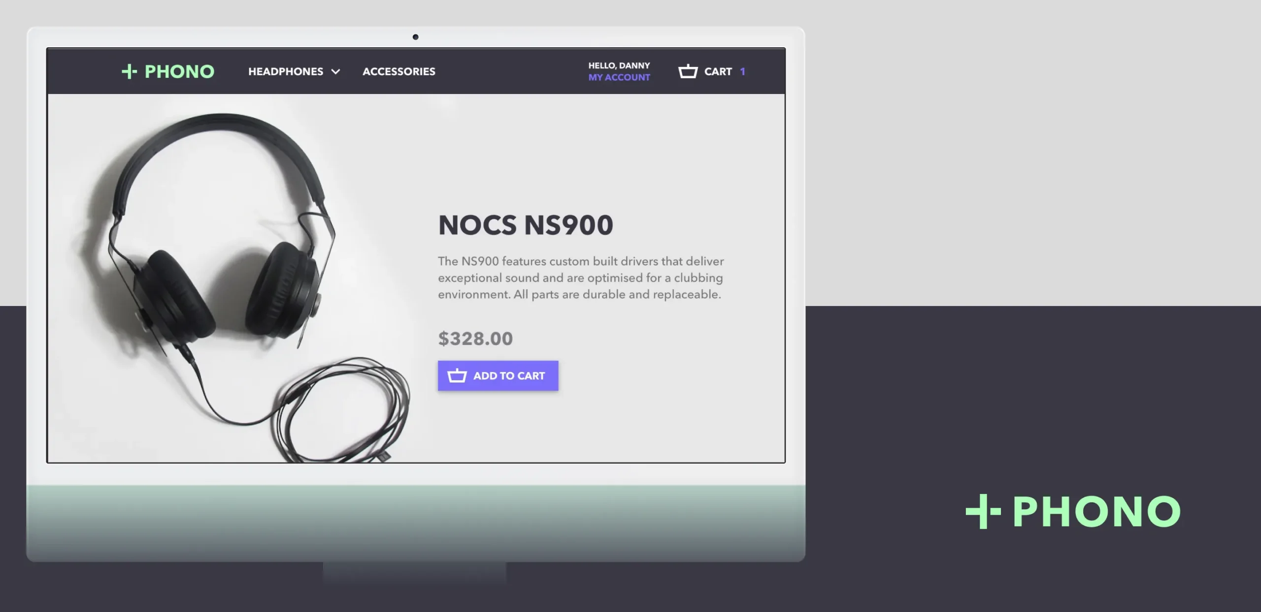
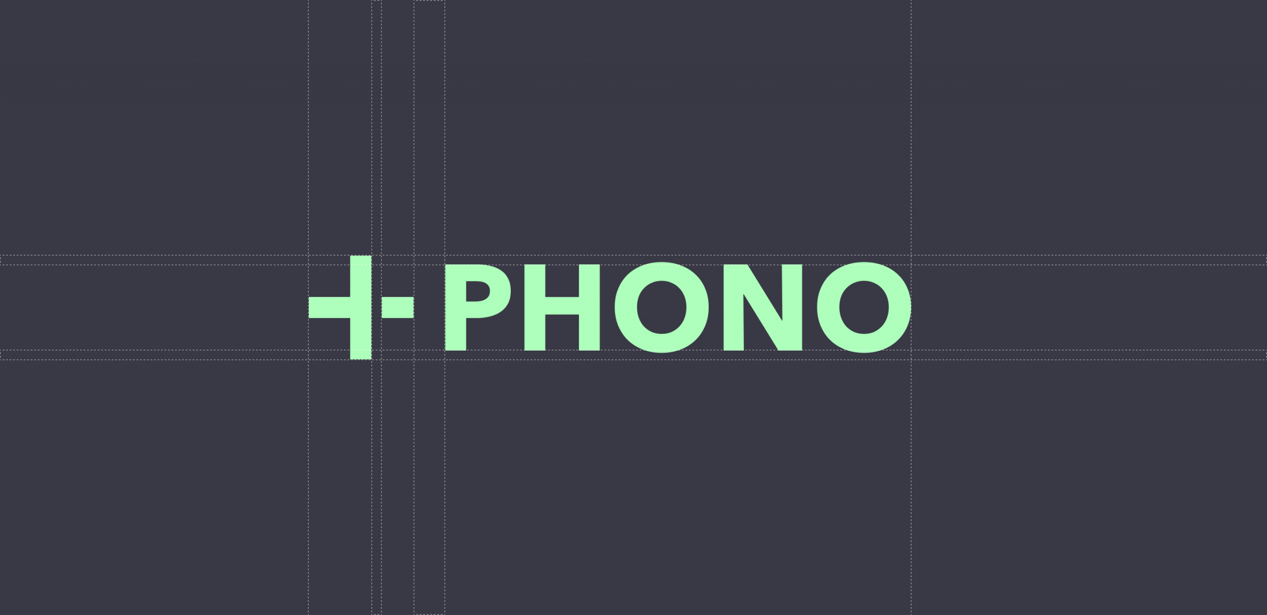
The branding
The logotype incorporates '+' and '–' symbols, representing speaker wiring, to visually convey the brand's connection to audio technology.
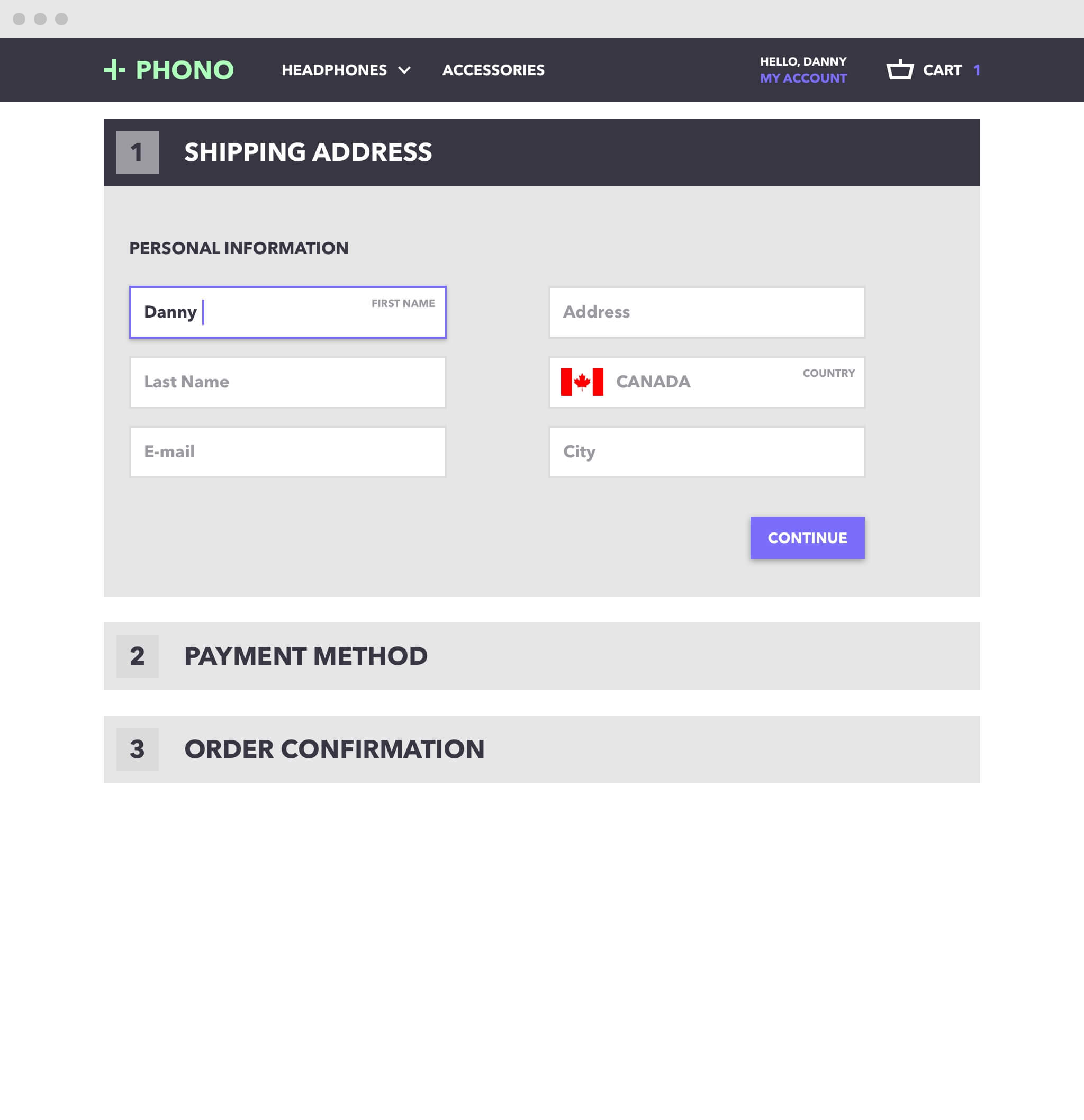
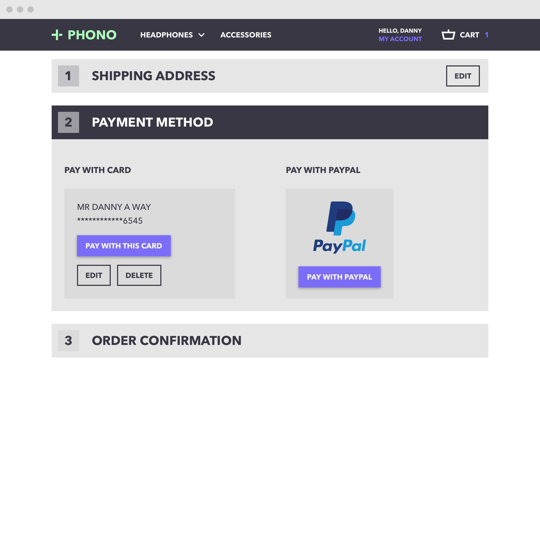
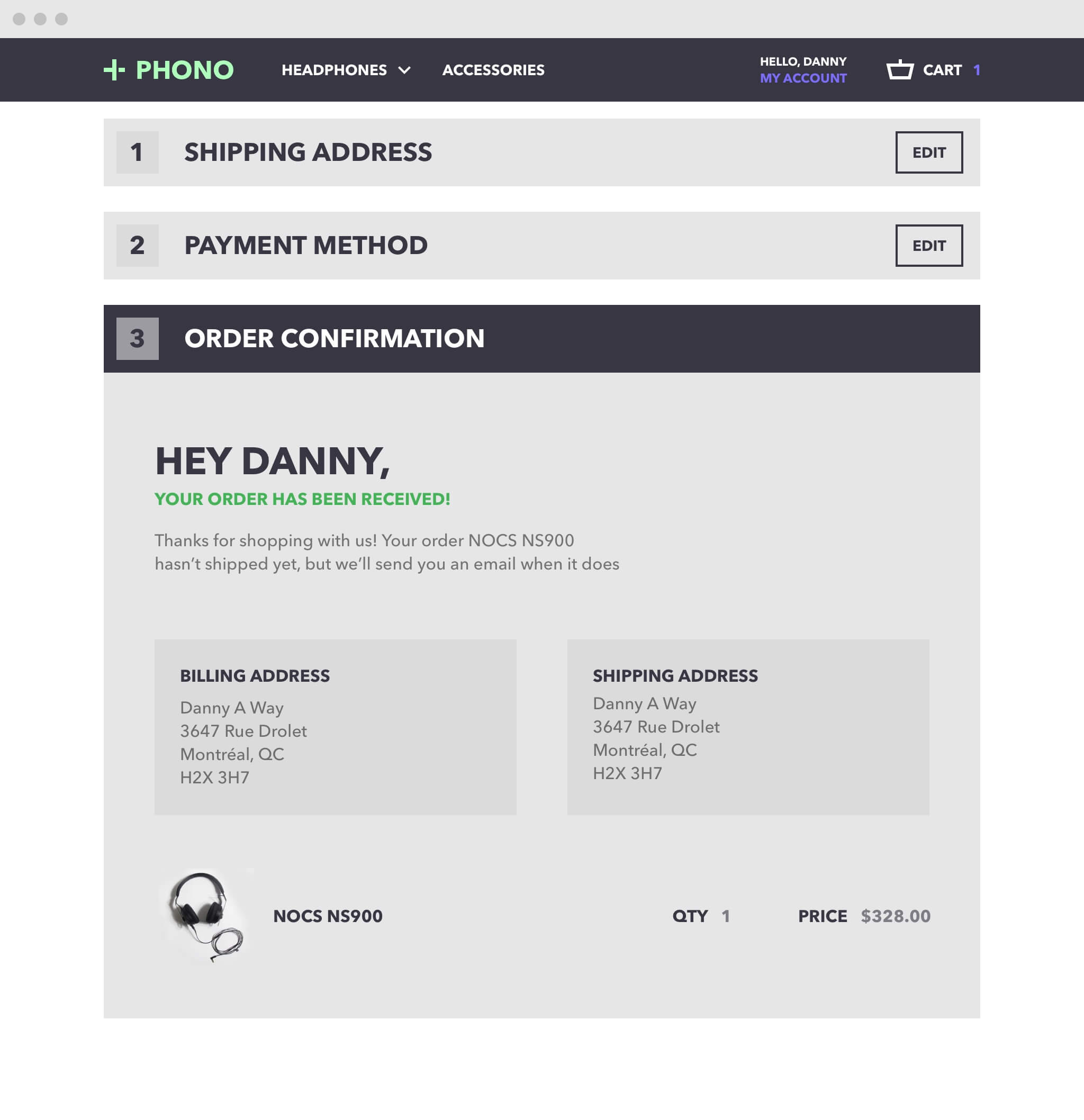
Checkout accordion
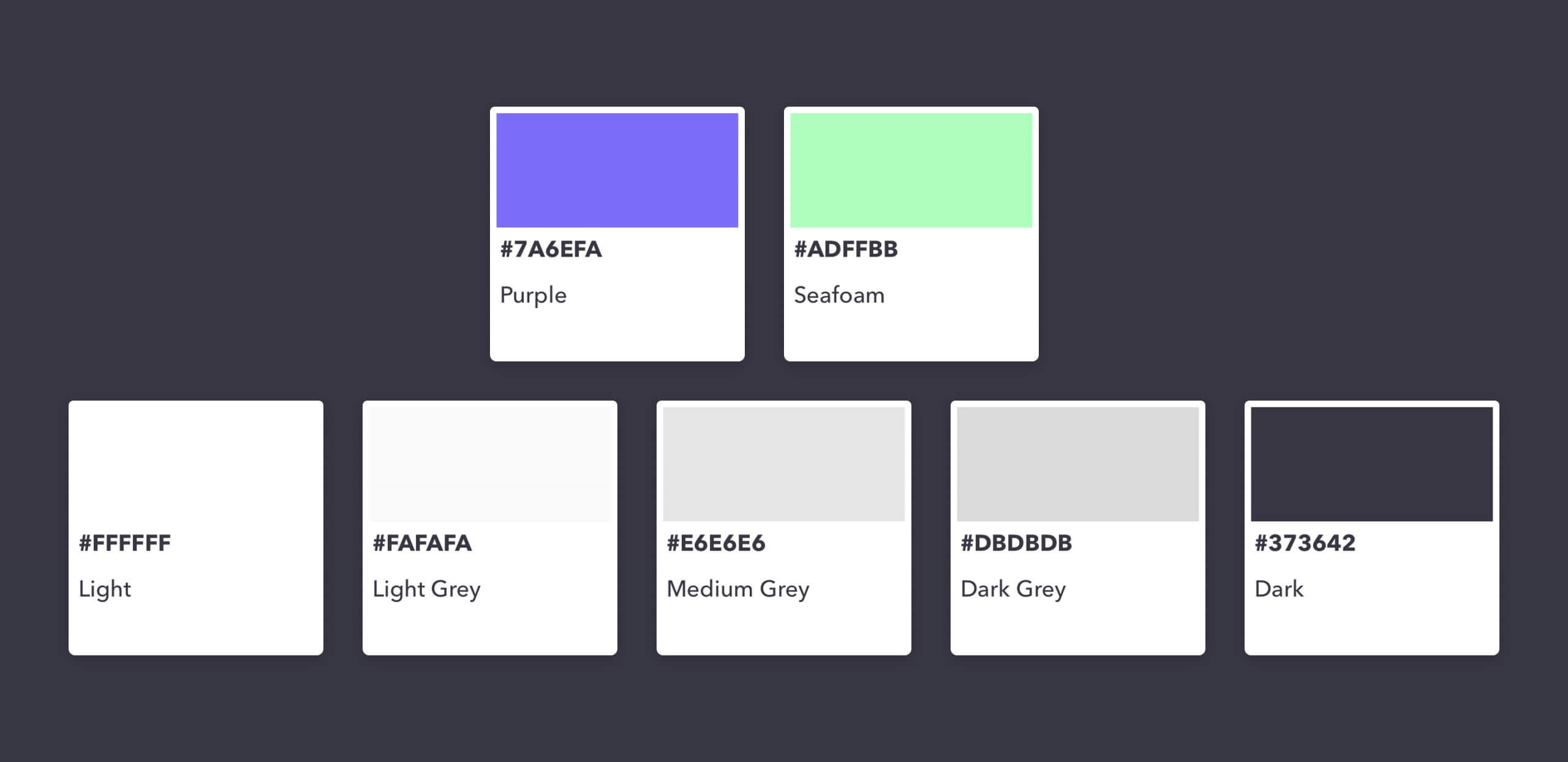
The colour palette
We chose these colours to reflect a balance between professionalism, creativity, and approachability, appealing to a diverse audience of music enthusiasts.
Also worth a look
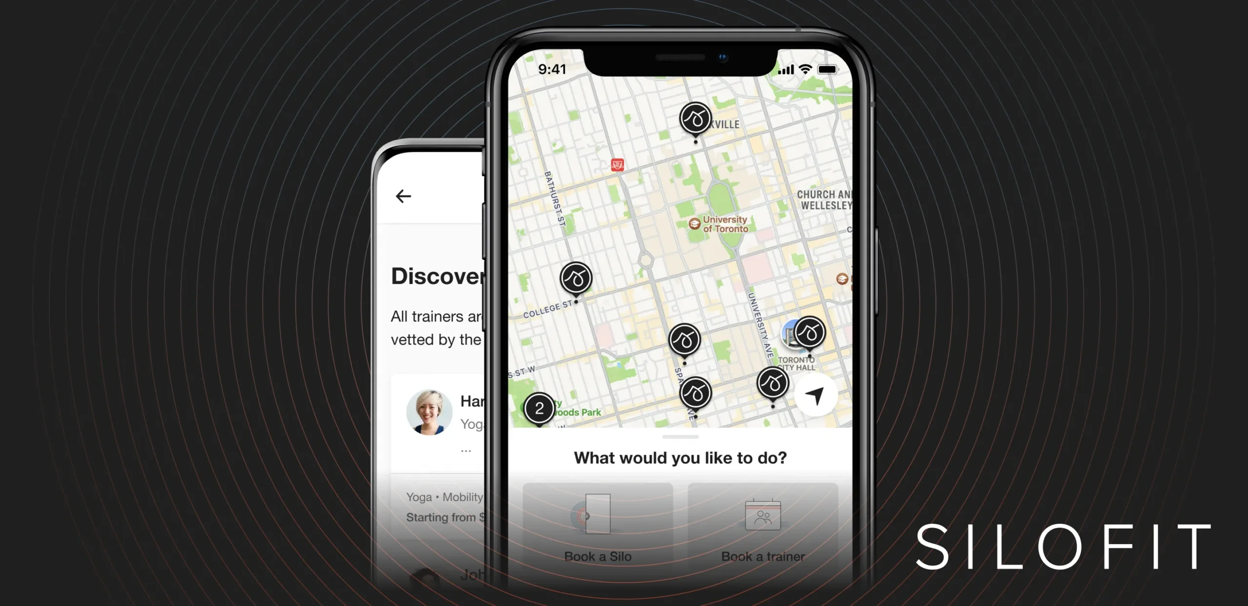
Transforming unused office spaces into private, on-demand micro-gyms2017-2022 - iOS & Android
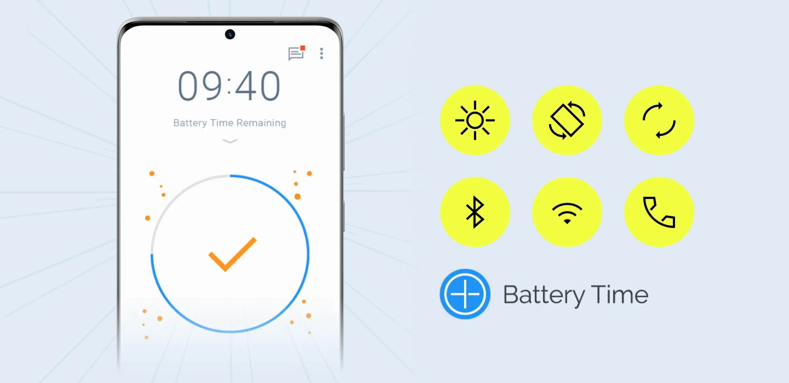
Helping users extend and save battery2016 - Android